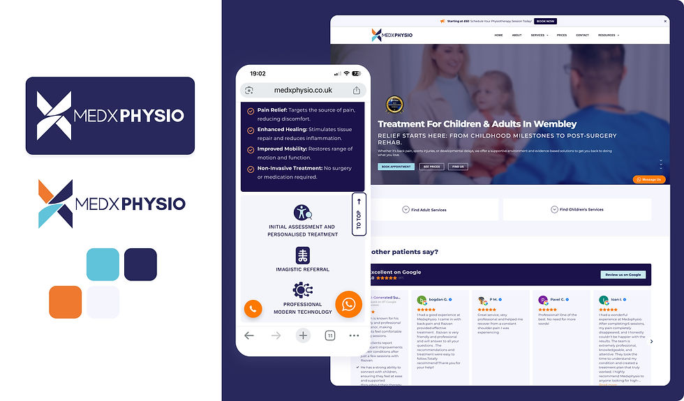
Medxphysio • Private physiotherapy practice
Medxphysio started as a single therapy room with strong clinical expertise, but without a clear or consistent way of presenting that expertise.
The existing identity felt informal and limited in how it communicated professionalism, structure, and long-term vision.
The goal was not just to redesign the brand, but to reposition the practice, creating a system that reflects where the business is going, not just where it started.
.jpeg)
What Shaped The Direction
THE CORE PROBLEM
The challenge was not a lack of expertise, but how that expertise was perceived.
Without a clear structure and visual system, the practice felt smaller and less established than it actually was, despite offering advanced treatments and a high level of care.
A small, local setup needing to feel structured and credible.
An advanced integrated treatment approach not reflected visually.
A dual audience: adults and paediatric patients.
A future vision of a multi-location, scalable physiotherapy brand.
Design decisions
The identity needed to balance multiple tensions:
-
Professional, but not cold
-
Medical, but still approachable
-
Suitable for both adults and children
-
Advanced, without feeling overly technical


This led to a structured, modern visual system built around:
-
Navy tones for professionalism and authority
-
Light blue for medical trust and familiarity
-
Orange accents to introduce warmth and a subtle paediatric presence
The result is a brand that feels clean, sharp, and credible, with just enough energy to remain approachable and human.
Approach
establishing IDENTITY
The project went beyond visual design.
It involved shaping how the practice is understood and experienced across all touchpoints, from brand identity and messaging to website structure and patient journey.
This included:
Early-stage social media direction.
Full brand development from scratch.
Website UX/UI and implementation.
Service structure and content logic.
Messaging adapted for non-medical users.
Booking and enquiry flow optimisation.

Scope
Brand identity (logo, colour system, typography)
Website design and implementation
UX structure and service page logic
Messaging and tone refinement
Patient journey and booking flow
Social media visual direction

What makes this Bussiness model different
Integration of advanced equipment within each session.
Combination of hands-on therapy and technology-led treatment.
Full-session approach, treating the patient holistically, not per technique.
Expertise across both adult MSK and paediatric physiotherapy.
Result
Designed for where the business is going
The brand was intentionally designed around future growth, not current limitations. This ensures that as the practice expands into new locations, services, and formats, the identity remains consistent, scalable, and relevant.
The result is a brand and digital presence that feels significantly more structured and credible than the original setup.
Despite operating from a single therapy room, the practice is now perceived as a professional, multi-practitioner clinic.
Patients discover the practice through search, trust the brand, and often arrive with a clear decision already made, reinforcing the strength of the positioning and presentation.
The identity also creates a foundation for future growth, supporting plans for expansion, additional services, and a broader physical presence.